Actual Churning Dirt
"The history of the spirit is dressed in that of circumstance."
Writings Elsewhere
My translation of Territories of the Soul/On Intonation by Wolfgang Hilbig is now available through Sublunary Editions.
I wrote a profile of Hilbig for The Poetry Foundation. Though translations of his books have been out for years—and very good translations at that—I haven’t seen much critical writing about the East German poet for English-speaking readers. Hopefully, this essay will lead to more discussion of him and his work.
The Actual Churning Dirt
I’ve been working slowly (read: very slowly) to convert my concrete back patio into a garden. The raw materials aren’t very inspiring. Or at least they don’t inspire me to physical labor. For now, I just have a narrow strip of dirt, not much more than a foot wide by twelve feet long, filled with a thin layer of heavy clay that turns into a fecal-colored paste when it rains, the same weight and consistency as newly mixed concrete. Once it has set and dried, the clay glitters brightly in the sun, due to the mica particles eroded from the native schist bedrock.
The Wissahickon Valley has some of the oldest rock in the Commonwealth of Pennsylvania, dating back to the Ediacaran period, half a billion years ago, when complex multicellular life was first evolving—a time before eyes, before jaws, before predation as we know it. The rock was first deposited as mud on the bottom of a tropical sea. It was then buried and cooked into the schist that was eventually, exposed again through erosion, providing native building material for rowhomes in Philadelphia.
As it glimmers in the dark gray rock, the mica preserves an ancient trace of the noonday sun beating down onto that shallow tropical sea of Pennsylvania. A worm crawls across a microbial mat. It consumes the algae and bacteria growing in its immediate vicinity and then crawls on, following a gradient of nutrients to another microbial mat, the beginnings of behavior, the beginnings of perception. No animal eats another animal to live. Heterotrophy is a placid affair, a game between equals. Then jaws start to appear—dentition, obligatory carnivory.
This is what I turn over by the shovelful, trying to break the lumps of clay and sound out the bedrock, while a fleet of motorcycles roar past a few dozen feet away and the neighbor’s dog lets out a shrill string of yaps in response, certainly more shrill and just as loud as loud the motorcycles themselves, the noise of the city (or rather its suburban periphery) and the animals it contains, the complex behaviors they enact.
On the Presidential Debates
The great hidden sea of the unconscious leans to speak into the podium microphone.
On the Incidental Poetry of Type Specimens
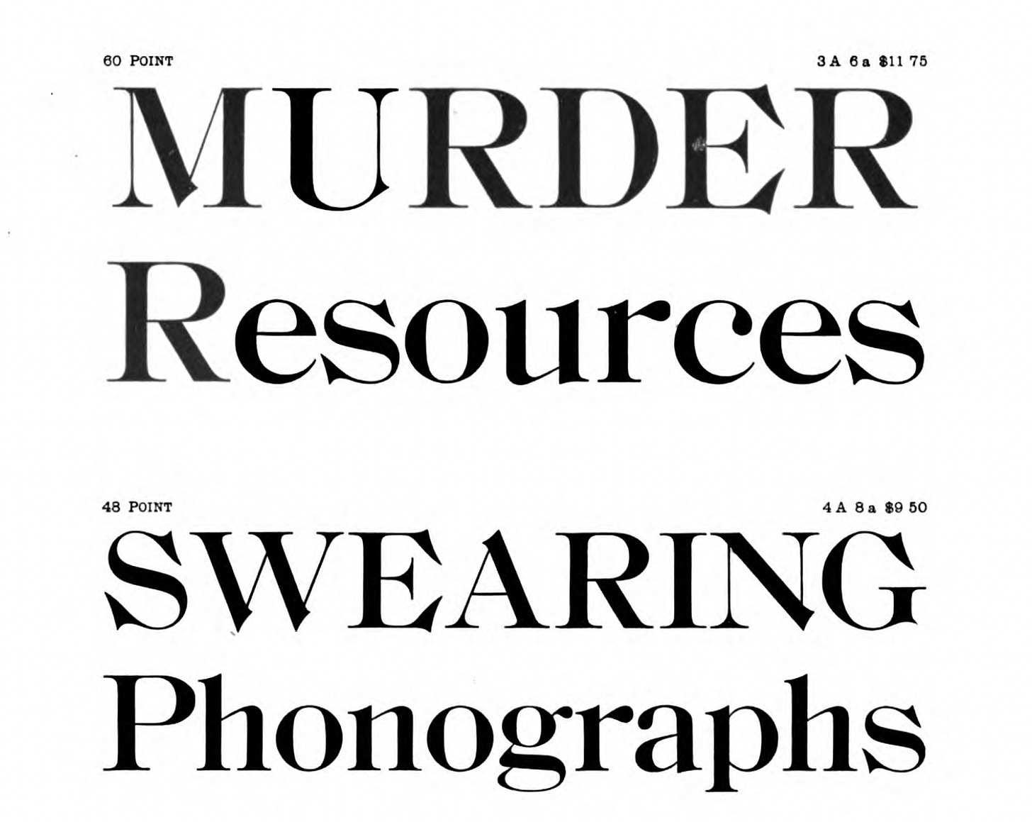
I’ve been selecting fonts and other design elements for a new publishing project. For inspiration, I’ve been looking at late 19th and early 20th-century type specimen books. At that time, graphic designers, printing companies, and type foundries would provide layout examples in the form of books to demonstrate their printing capabilities. Before the invention of Lorem ipsum as a standard placeholder in the 1960s, these type specimen books would select example text more or less at random. One work that I’ve been consulting, Desk Book: Specimens of Type, Borders & Ornaments, Brass Rule & Electrotypes, and Catalogue of Printing Machinery and Materials, Wood Goods, Etc by the American Type Founders Company (1898), uses the Declaration of Independence as a placeholder for much of the book. Perhaps the authors thought of “We the People” as an excellent representative headline. It is. But once the patriotic preliminaries are dispensed with, the Desk Book then ventures into more examples. I found many to be quite funny.
While some of these example texts could very well be taken from actual headlines or advertising copy, others are more clipped and gnomic:
A phantom event, outlined but never filled in, is evoked in the sample headlines and then dismissed just as quickly, the typographers moving on to a different font size. I’m reminded of William S. Burroughs’ use of cut-ups in novels such as Nova Express, or Mark E. Smith’s sarcastic sing-speak intonations of advertising slogans. The example texts have a hand-assembled, analogue quality that is much more unpredictable, much more playful than contemporary type specimens, which seem much more deliberate in demonstrating use cases for a given font. Play never happens in a frictionless environment.
More than being a resource for my own typesetting work, these specimen books are a reminder that print exists, at least in its ideal, as a physical phenomenon. They were advertisements for specialized industrial equipment. Fonts were cast metal components that, through mechanical manipulation, were used form the ABC in all its diverse permutations. As text becomes virtualized, its weight evaporates. (The irony of writing this on Substack is, of course, not lost one). But physical typesetting can still serve as a guide, regardless of the medium. As difficult as it is to use design software, racking out each letter, letter by letter, onto a composing stick or composting them through a gigantic linotype machine is far more laborious, but the results have a substance that’s not merely metaphoric.


